My Role
UX Designer, UX Researcher
Timeline
Dec 2021 - Jun 2022
The Challenge
U.S. consumers just aren’t that into tea
Despite its long history, variety, and health benefits, tea is not as popular in the U.S. as one might expect. Other drinks with rich backgrounds of their own—such as coffee—have a relatively stronger presence in the U.S. market. I first noticed this trend among the people around me. When I looked at articles and different pieces of market data over the last few years, they seemed to confirm my impression. This struck me as a huge missed opportunity. After all, tea has the potential to benefit consumers in multiple areas, such as health, focus, and social bonding, to name a few.
I hypothesized that one of the most feasible ways to impact U.S. consumer attitudes would be to leverage the reach and speed of a mobile app. This led to the question: how might we design an app that can grow tea’s popularity and make it relevant to the needs of U.S. consumers?
The Solution
An app that focuses on early users
I created an app that serves as a gateway into the world of tea for U.S. consumers. Camellia—named after the scientific name for the tea plant—is designed to foster a growing community of tea-drinkers. As shown by my research further below, Camellia does this by appealing to the needs of a key demographic for growing consumer trends: the early users!
Learn
Search for tea by features like type, caffeine level, and origin.
Access information on a tea’s background, health benefits, flavor, and preparation.
Expand
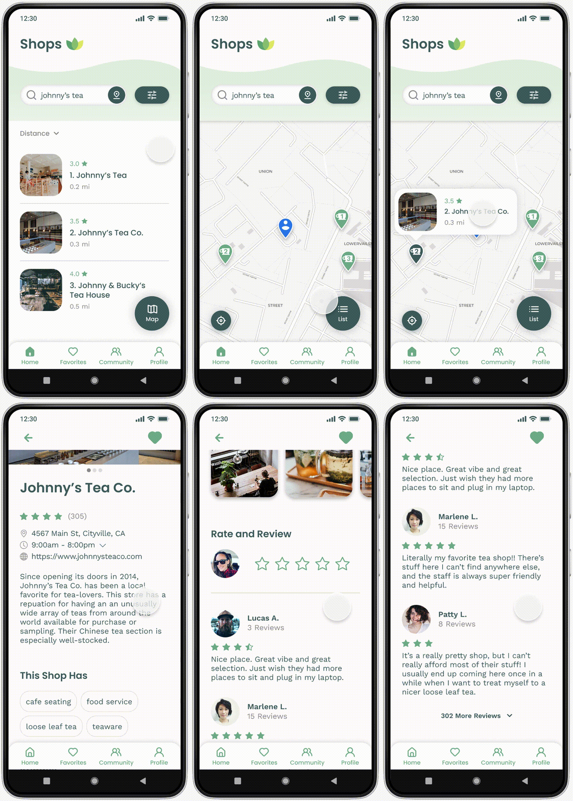
Explore shops in your area that sell or serve tea.
Dive deeper into topics like tea history and how to use tea in a variety of recipes.
Connect
Find tea-related events in your area.
Link up with groups for discussions or in-person activities.
Academic Research
Starting insight: different waves of users have different needs
When looking into what drives people to adopt new ideas or products, I found that one of the main social science theories stresses the importance of appealing to the needs of different waves of users—from the earliest trend setters to the late comers.
The primary ways of winning over both the earliest users, as well as the larger majority that follows, include:
Showing the benefits.
Providing clear instructions and guides.
Highlighting other people who’ve already joined in.
Other academic research further backs the importance of showing users they’re not alone when venturing into the world of a new or innovative product. According to this research, even in the online world, “the mere presence of others…will lead to a higher willingness to [try] innovative products.”
Initial Interviews
Interviewees touched on themes that resonated with the academic literature
To learn more about potential early users, I scheduled seven structured initial interviews. The interviewees were all working adults residing in different parts of the U.S. Most of them had minimal to moderate exposure to tea, but were not dedicated tea-drinkers. Their attitudes towards tea ranged from mildly curious to generally positive. None of the interviewees actively disliked or avoided tea. Although testing for more specific traits associated with early adopters would have involved going beyond what was feasible for this project, I still hypothesized that this sample would give me a good snapshot of Camellia’s early users.
After conducting the interviews and analyzing the data I collected, I noticed a few consistent themes:
The larger community plays a big part in opening up users to new products, as well as keeping them interested.
Users tend to view a new product through the lens of their particular interests, hobbies, or concerns. Interviewees brought up topics like time management, quality time with others, health, food exploration, learning, and mental focus.
Good visuals are crucial for easing new users into a product. Across the board, interviewees brought up the importance of clear, appealing visuals when considering what a new product can offer.
User Personas
The potential trailblazers of tea
After analyzing my initial user interviews, I created the following user personas to help guide my design.
Competitive Analysis
Limited function & limited connection
Looking into some of the most popular tea-themed apps available, I found that none of them seemed to combine the elements needed to attract new users and reach a majority of the population. In particular, the extent to which these apps tried to connect the user to a larger community—whether online or in-person—was very limited.
Main Takeaways
I identified three guiding themes
Looking at where the different parts of my research align, I arrived at three main takeaways. These represent what a gateway experience for tea should focus on:
Instruction
Present clear and visually-appealing information on how to prepare and use tea
Benefits
Showcase different benefits that tea might provide for different kinds of users
Community
Highlight the larger tea-drinking community and make it easy for the user to connect
Ideation & Iteration
From low to high-fidelity
I experimented with rapid sketches, trying out different ideas based on the data points I’d gathered. After deciding on a basic set features and information architecture, I created low-fidelity wireframes. You can view the complete low-fidelity user flow here.
Once I had my low-fidelity wireframes ready, I conducted a round of interviews with a new set of interviewees, once again chosen to represent Camellia’s early users. Based on the information I gathered from these interviews, I made various changes to the design, which included:
Scrapping the Discover Page - When viewing the homescreen, users were confused about the purpose of this page, which was intended to house search tools for tea, shops, and recipes. This created a big point of friction for accessing some of the app’s key features. I addressed this problem by re-thinking my approach to information architecture. In order to reduce the workload on users, I broke up the contents of the Discover page, putting Teas and Shops in a much more prominent place.
Redesigning Map Icons - Most users reported having trouble noticing the map icons that represented tea shops. Specifically, users complained that they couldn’t make sense of the icon, which was meant to be a tea mug. I addressed this problem by redesigning the icons into a more recognizable tea cup and saucer shape.
Making Images More Consistent - Users had very positive reactions to the use of images across the app. However, some users pointed out that the use of images was not consistent when it came to search results. Specifically, search results for teas and shops featured images, while search results for recipes only featured a name. I fixed this issue by making sure that the design pattern consistently featured images in search results.
I used these and other insights from the interviews to create an updated, high-fidelity iteration of the design.
Evaluation
A new round of testing showed where the design had improved—and where it still needed work
In order to evaluate and further refine the app with more precision, I conducted a round of usability testing. This consisted of seven structured user tests via Zoom. Once again, the users were selected to represent a sample of Camellia’s early users. Each test followed a script, in which I asked the user to think out loud as they navigated the app and performed a series of tasks.
My primary goals were: (1) Identifying and tracking usability issues; and (2) gaining insight into possible solutions for those issues. To help meet these goals, I organized the the test result data into a rainbow spreadsheet.
Final Iteration
Main improvements included changes to the UI and a new social feature
Overall, the data from the usability tests mentioned above indicated that my design was moving in the right direction. On multiple occasions, users responded well to changes I had made based on previous interview feedback. Nonetheless, the test results still led to changes in the app’s UI and information architecture, as well as one new feature.
More Ways to Connect
Based on users’ strong desire for more ways to experience tea in a social way, there is a new section called Community.
Community is a dedicated social space where users can join activity or discussion groups, as well as connect directly with each other.
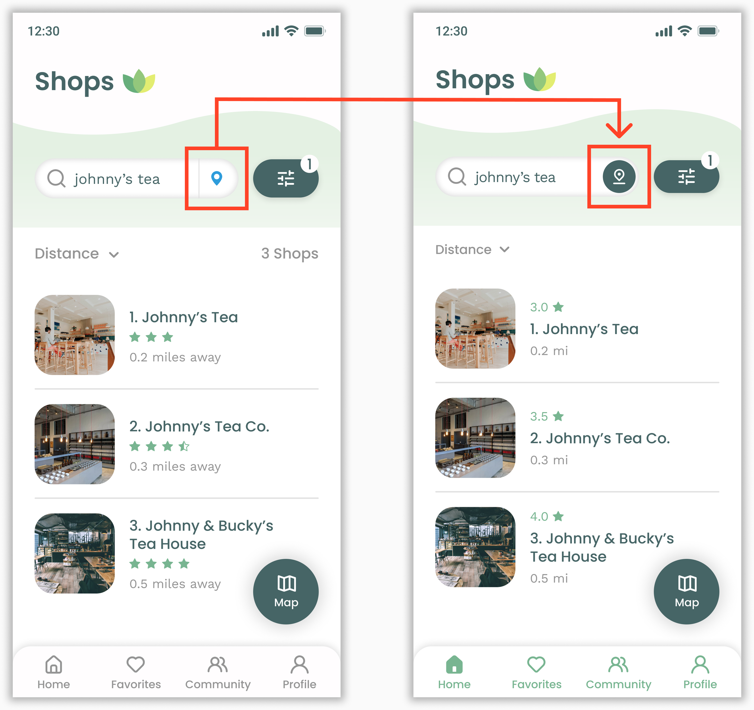
A More Accessible Way to Search
Modified location button to match the style and size of the filter button.
Improves the design’s overall consistency. More importantly, it makes this search feature more accessible by improving its visibility.
Less Friction When Managing Favorites
Each item on a user’s Favorite list now features a heart icon button.
The new button allows users to remove Favorite items without having to navigate to other screens, drastically cutting down the number of steps some users would need to manage their lists.
The Final Design
High-fidelity screens
Figma prototype
Style Guide
Conclusion & Reflection
The pros and cons of self-direction
My goal with this solo project was to go through the process of making a UX case study, using my own idea for an app. I wanted a challenge, but also something that would stoke my creative flare. Hence, I chose something that’s been a big part of my day to day life since I was very young—tea!
One one hand, working on a self-directed project made parts of the process more streamlined, as I was the only decision-maker involved. On the other hand, there were many times where I clearly saw the immense value of having a team that could provide fresh ideas, point out the unseen pitfalls, and keep the project from steering off course.


